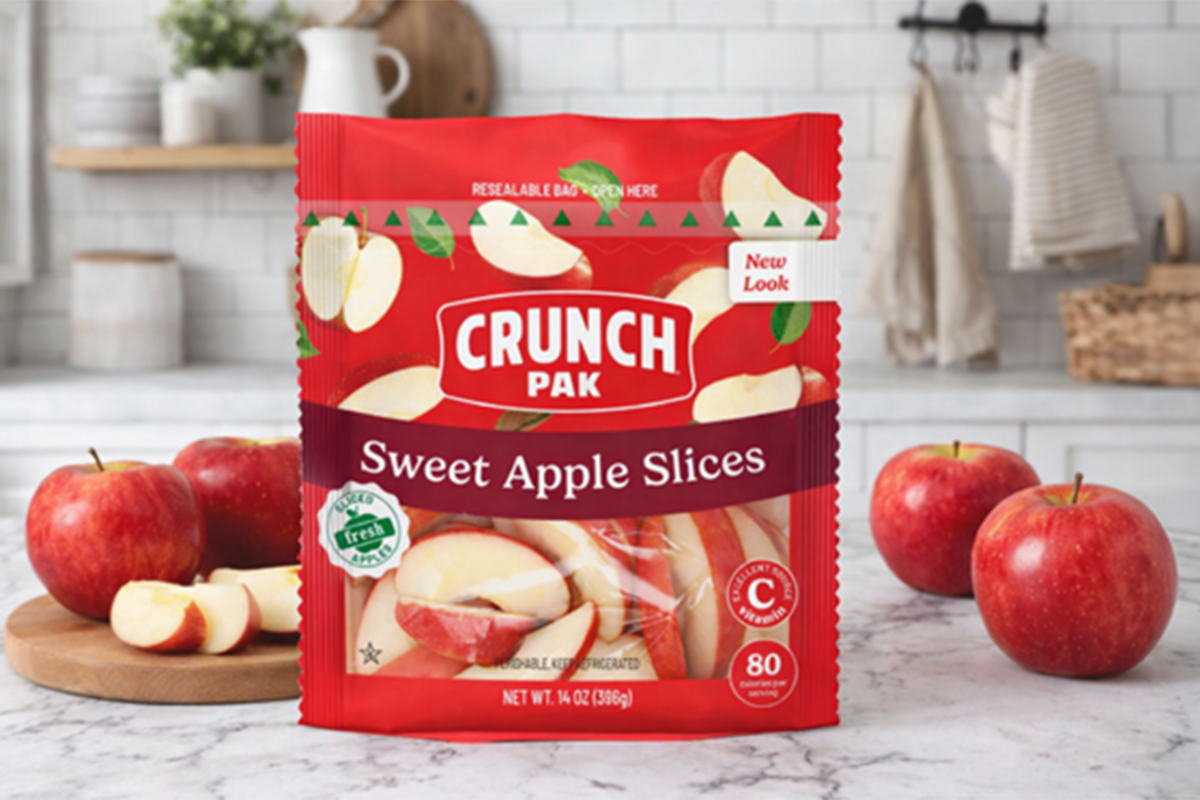
Crunch Pak plans to roll out a refreshed brand system this May, featuring a new logo, revitalized packaging and a modernized look across its core product lines. Designed with both shoppers and retailers in mind, the update supports faster shopping decisions and stronger brand blocking, the company says.
The 2026 refresh prioritizes primary SKUs, with artwork and mechanicals currently moving through final approvals, according to Crunch Pak. Updated brand assets will launch through its standard retail and partner channels, while web and digital visuals will transition in parallel with the market rollout to create a consistent brand experience across every point of contact.
Rooted in Crunch Pak’s commitment to making healthy snacking simple and inviting, the refreshed packaging delivers clearer variant cues and vibrant new imagery, helping shoppers find their favorite products in seconds, says the company, which adds that retail partners will also notice a stronger shelf presence.
“Our newly designed logo emphasizes the concept of ‘Crunch,’ capturing both the emotion and sensation associated with fresh produce,” says Andy Kimbrel, executive vice president of Crunch Pak. “This focus aligns our visual identity with the core experience of our products. We are confident that the updated brand architecture will enhance communication with consumers. Furthermore, it enables us to unify the brand elements from our licensee partners, creating a consistent and cohesive appearance across our entire product line.”
“A strong brand and packaging system enables us to work more efficiently, focus on innovation and maintain a clear, cohesive presence on shelf,” says Kim Green, marketing and creative director for Crunch Pak.
The updated look and feel extends beyond the pack, with a refreshed logo, contemporary typography and a more energetic, cohesive tone of voice that signals where the brand is headed and better aligns with how today’s families talk, shop and snack, according to the company, which says the rebrand also reinforces what has made it a trusted name for more than two decades: delivering fresh, high-quality produce in ways that make sense in real life.